
Getting Started with the Form Editor
After launching the Form Editor and selecting Tools → Login, the form designer performs a login operation during which he or she enters his or her login and password assigned in the docuRob ® platform ontology or in an external dictionary management system.
If you have successfully logged into the system, the user will be asked whether the dictionary definitions should be refreshed from the server to which you logged in. Refreshing dictionaries is also available from the main menu Tools → Refresh dictionaries.
Refreshing dictionaries involves downloading from the server the current list and contents of dictionaries defined in an external system of which the dictionary management module is a part.
Once the operation is complete, the dictionary refresh window is presented, which displays the following information:
- Last update - date and time of the last refresh of dictionaries,
- Status – name and identifier of the dictionary that is currently being updated,
- Number of dictionaries – number of dictionaries defined on the server,
- Number of processed – shows the number of currently refreshed dictionaries (this value changes during the update)
- Number of errors – the number of dictionaries that were not updated due to an incorrect definition in the dictionary management module.
The designer starts by selecting the Load type definition function ( icon  ) in the type definition window, after which the type definition loading window is displayed, presenting a list of available types. After selecting one of the presented types and selecting the Open button, its definition (attribute list) will be read and presented in the type definition window. Pressing the Refresh button will re-read the type definition.
To check or make changes to the configuration settings, select Tools → Configuration from the main menu.
The configuration window displays the currently set address of the type and form repository. The server address is automatically retrieved from the configuration data when the Form Editor is launched. The user can change the data displayed in this window.
Central Form Data Directory
Regardless of the adopted application architecture, one of the basic requirements for IT systems is to maintain semantic consistency of processed and stored data. This results not only from the need to maintain compliance with applicable regulations, such as personal data protection regulations, but also from such key requirements as maintaining the confidentiality and integrity of data resources or ensuring the feasibility of integrating pre-existing IT systems.
Of great importance is also support for designers and developers of IT system software, allowing for the automation of routine work and, consequently, reducing costs and shortening the implementation time.
The docuRob ® Ontology module based on the ISO/IEC 13250 standard is used as a tool for creating, sharing and storing semantic resources of information systems implemented with the use of the docuRob ® platform tools*.* One of the key elements of these resources is the Central Form Data Catalog.
Figure 1. The main menu of the docuRob®Ontology module*.*
Document/Form Catalog
The document/form catalog ( Figure 2 ) is presented in the Ontology module as an alphabetically sorted list of form types used in the organization. A new catalog item is added after completing all mandatory fields of the document metadata form provided after calling the Add service.
After creating a new form type defined in the catalog, you must declare its attributes using the appropriate context menu item. Declaring an attribute type involves creating a link to a selected attribute type catalog item and entering the required metadata.
If the designed form requires an attribute that is not in the form attributes catalog , a new list item should be created.

Figure 2. Document/form type catalog
Attribute Type Catalog
The attribute type catalog ( Figure 3 ) is the primary source of information regarding semantic information about forms processed in the work processes of a given organization. The catalog is an alphabetically sorted list of attribute names. The metadata of the catalog entries allows for the introduction of attribute definitions and types. values and methods of its storage.

Figure 3. Document/form attribute types catalog
Completing the list of attribute types involves executing the Add service and entering mandatory definition field entries.
Catalog of dictionaries of forms and workflow processes
The dictionary directory ( Figure 4 ) contains all the dictionaries used both for selecting appropriate form field values and for processing these values in BPQL expressions used in workflow processes.
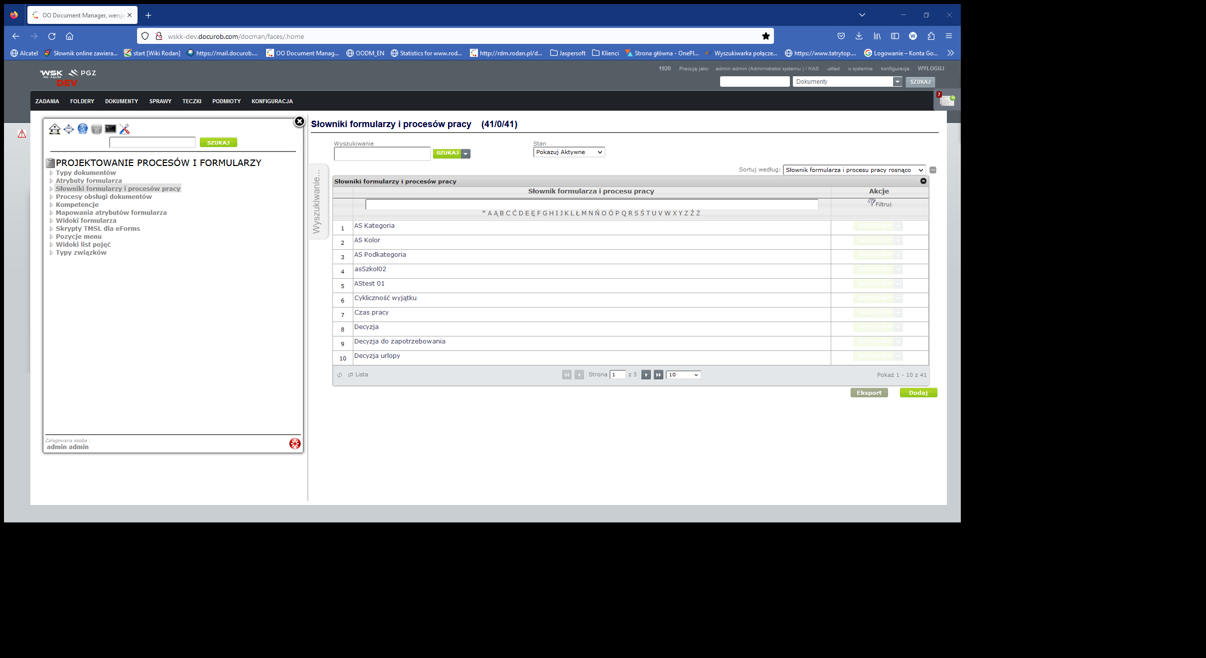
Figure 4. Catalog of dictionaries of forms and work processes
In the case of internal dictionaries, dictionary entries are directly available within the Ontology module resources. In the case of external dictionaries, access requires the creation of appropriate TMSL ( Topic Maps Scripting Language ) scripts and placing the Reference in the appropriate field of the dictionary definition form.
Document/form handling processes catalog
The document/form handling process catalog ( Figure 5 ) is an important source of information for maintaining IT systems based on the docuRob® platform and for maintaining the required IT resource security policy. Entering process list items and completing their metadata is done in a similar way to the previously discussed directories.
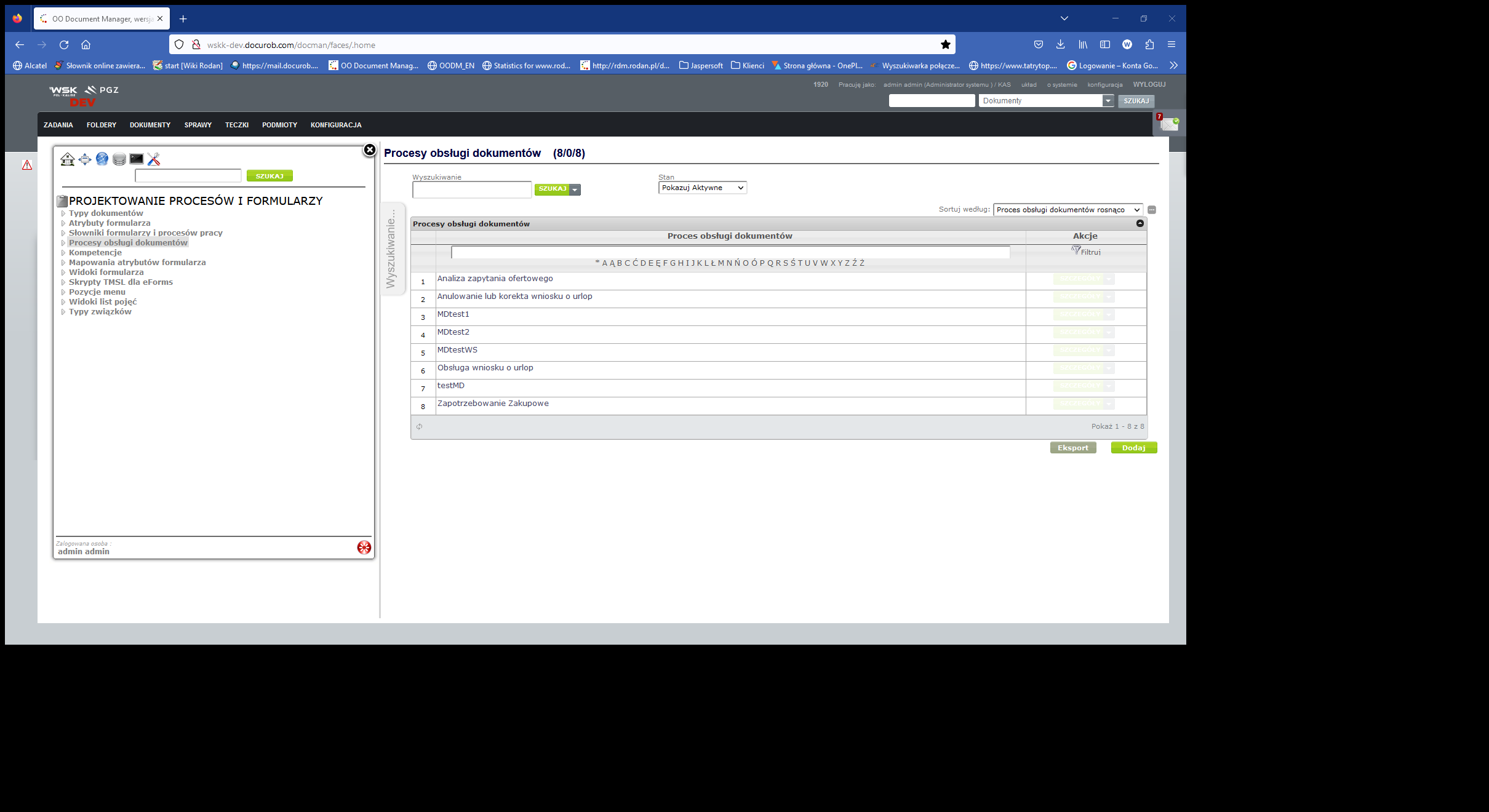
Figure 5. Document/form handling process catalog
Namespaces
An XML namespace is a set of names, identified by a URI reference, that are used in XML documents as element types and attribute names.
You can add namespaces to a document type from the details page of the selected type. When you select Namespaces a page containing the Namespaces table will be displayed.
Forms Repository
After clicking the Forms Repository button, its window is displayed or, if there are no saved forms for a given document type, the message No saved form versions for type XYZ is displayed.
The Form Repository window displays all forms versions related to the type definition loaded into the Form Editor. The attributes of the form version selected from the list (highlighted) are displayed in the lower part of the window.
In the Form Editor, one may download any existing version of the form. This requires previously loading the type definition (e.g. Invoice ) and selecting the Form Repository button. A window will then be displayed containing a list of all versions of the Invoice form saved in the form repository. The user can select one of the versions and by selecting the Download button read a form file from the forms repository and then open it in the form window.
It is also possible to change the active version of the form, in this case you should also download the definition of the given type (e.g. Invoice ) and select the Form Repository button. A window will be displayed containing a list of all the versions of the form saved on the server, the user selects the version they want to activate and selects the Activate button.
Form level operations
Open form
To open a form file , click the button on the form editor toolbar  that opens the form file or select File → Open from the main menu.
The file open window will appear. Then you need to:
- find the directory where the selected form is located and select this form,
- click the Open button to open the file (or Cancel to cancel opening) – the form will be loaded in the form window.
Save form
To save a form to a file, click the button  or select File → Save from the main menu. If you are saving a new form, the save window appears, then:
- in the save window, select the directory where the new form is to be saved,
- in the File name field , enter the name of the form,
- press the Save button to save (or Cancel to cancel saving)
The saved file has the extension form.
Save form as
To save a defined form under a new name and/or in a new location on the disk, click the button  or select File → Save as... from the main menu**.** The save window will appear. Then you need to:
- in the save window, select the directory where the form is to be saved,
- in the File Name field , enter the name of the form,
- press the Save button to save (or Cancel to cancel saving).
The saved file has the extension form.
Save form to server
After the form is finally defined, the user performs the operation of saving the form on the server.
The Description and Author attributes are taken from the form, so they are unmodifiable fields (their modification is possible in the form attributes window).
The user can indicate whether they want to activate the saved version of the form immediately. If the first version of the form is saved (e.g. Invoices ), the Automatic activation field is checked by default and is inactive. The active version of the form is the one that will be used when filling out the form on the browser page. Subsequent saves of the form result in the creation of subsequent versions.
Print form
To print the form, click the button  or select File Print from the main menu*.* A window with a printer selection will appear, after clicking the OK button the form will be printed.
Before printing, it is possible to:
- Setting page parameters (from the main menu: File → Page Setup ). The Page Setup option allows you to change the default print settings such as orientation (portrait, landscape) and margins (left, right, top, bottom).
- Form print preview (from the main menu: File → Print preview ).
Changing the visibility mode of form elements
The form designer can verify the settings of various attributes for form fields by changing the visibility mode of form elements , this is done by pressing the button  . A window with display mode settings will appear on the screen, allowing the following form field settings to be presented on the form:
- Displaying the name of the form field type,
- Displaying bindings to type attributes,
- Displaying the field name,
- Marking form fields with one of the following types :
- Writing
- Multi-line text
- Numeric - integer
- Numerical
- Dictionary and checkbox
- Marking of visible fields,
- Marking fields as read-only,
- Marking the fields belonging to all or one of the defined areas,
- Marking required fields.
The display mode settings window also allows you to enable a grid that presents the division of fields on the form.
Tracing associations with type attributes
The form designer has the ability to verify the connections between form fields and type attributes. To do this, enable the tracking mode for connections with type attributes using the button  , then selecting the form field will result in the following operations:
- when there is no association of a field with a type attribute - the message Type attribute not found is displayed ,
- when the association exists - the type attribute associated with the given field will be highlighted in the type definition window.
Selecting an attribute in the type definition window will select the form fields associated with the selected attribute.
Opening a new Form Editor window
To open a new window that allows you to work on another form in parallel or create a form from scratch, select Window → Open New Window from the main menu.
Arranging open windows horizontally ( Window → Arrange → Horizontally ) allows you to easily switch from one window to another and compare data entries and information in forms.
Form field operations
The form window is used to edit the appearance of the form. The contents of this window represent the appearance of the electronic form.
Each form field (and therefore its value) can be given meaning by associating it with a type attribute. This association allows you to later identify the type and meaning of the values entered into the form.
Form structure
The form is represented by a matrix of fields, which are the smallest components of the form. These fields have a specific type and a set of attributes depending on their type. The structure of the form has the following features:
- rows and columns can have different sizes (height or width),
- a form field with the width of one column and the height of one row is the smallest, indivisible part of the form,
- it is possible to merge multiple form fields,
- fields have a type and their own set of attributes.
These features allow you to create a form with any appearance that meets the highest requirements of an electronic forms designer.
In order to edit the appearance and behavior of form fields, a set of operations has been prepared that can be performed on individual form fields or on their groups. Operations are available through the context menu (activated with the right mouse button), buttons located on the toolbar or by modifying the attributes of form fields. A description of each of the available operations is presented below.
Checking multiple boxes
on a group of fields marked on a form in a similar way to a single field. An area of fields can be marked by:
- pressing the mouse button over the field that is the first corner of the selected area, dragging the mouse to the second corner of the selected area and releasing the mouse button,
- pressing the mouse button over the first corner of the selected area, pressing the SHIFT key and pressing the mouse button over the second corner of the selected area,
- clicking the mouse button over the row or column header element (all fields belonging to a given row or column will be selected),
- pressing the mouse key over a row or column header element, pressing the SHIFT key and pressing the mouse key over another row or column header element,
- selecting a field, pressing the SHIFT key and moving the selection pointer using the arrow keys,
- pressing the mouse button over the upper left element of the form header (all form fields will be selected).
- clicking the mouse button over a field while holding down the CTRL key adds or removes the field or range from the selection
Copying fields to clipboard
To copy the selected fields to the clipboard, right-click one of the selected fields and select Copy Fields from the context menu. You can also use the Edit → Copy Fields menu.
Pasting fields from the clipboard
To paste selected fields from the clipboard, right-click over the field from which the pasted area is to begin and select Paste fields from the context menu. You can also use the Edit → Paste fields menu. The cells in the pasted area will be formatted and merged accordingly.
Pasting style
To set the style of the selected fields, right-click one of the selected fields and select " Paste style" from the context menu. You can also use the Edit → Paste style menu. The fields in the selected area will adopt the style of the first field in the copied area.
Merging form fields
Merging fields allows you to customize the appearance of the form. To merge fields, select more than one form field, right-click one of the selected fields and select the " Merge fields " operation from the context menu.
In the operation of merging form fields, the field over which the context menu is displayed plays an important role, because it is this field that will be extended to the selection area (type, content, and border).
Only a selection area that is a rectangle can be merged.
Modifying Field Attributes
Form field attributes can be modified from the Form Field Attributes window.
Modifying Field Borders
To modify the style of the field borders, select the selected fields and then select Cell Borders from the context menu or press the button ** **on the toolbar. A window will appear on the screen that allows you to change the border parameters for each edge of the selected area and for all edges inside the selected area. It is also possible to set the rounding of the corners of the selected area by specifying the radius in pixels for each corner.
A set of buttons is provided on the toolbar allowing you to quickly set up predefined border types.
Form line operations
Marking rows
To select a single row, click the mouse button above the row header.
It is also possible to select multiple rows by holding down the SHIFT or CTRL key between clicking on the row headers.
A row is selected when all the boxes in that row are selected.
Pasting rows
To paste selected rows from the clipboard, right-click over the field from which the pasted area is to begin and select Insert rows from the context menu. Rows from the clipboard will be inserted before the row containing the selected field.
Inserting a row
To insert a new row, right-click on the row header and select Insert row. As a result of this operation, a window will appear in which you can specify the number of rows to be inserted. Inserting a row copies the formatting from the row you clicked on.
Duplicating a row
To duplicate an existing row, right-click the row header and select Duplicate Row. Duplicating a row copies the formatting and content from the row you clicked on.
Delete a row or rows
To delete a row, right-click on the row header and select Delete Row. If more than one row is selected, you can select Delete Rows.
Adjusting the row height
To adjust the row height to the contents of the fields in a given row, right-click on the row header and select one of the row height adjustment options:
- Fit Row - this will change the row height so that its height is the minimum height needed to display its content; works on the row on which the context menu appeared,
- Increase row height - an operation similar to the previous one, with the difference that the height reduction is not performed, i.e. if the row is higher than needed, its height will not be reduced, but if its height is too small - it will be increased; works on the row in which the context menu appeared,
- Match Rows - identical to Match Row , but works on all rows that are selected,
- Increase Rows Height - identical to Increase Row Height , but works on all rows that are selected.
Adjusting the row height for merged fields works in such a way that if the row on which the adjustment operation is performed is the last row of such a field, it is taken into account. It causes only the last row to be adjusted - reducing or increasing its height depending on the selected option.
Set the height of the row or rows
Allows you to specify and set the height of rows. The height is set via a dialog where you enter the height of the row/rows in millimeters rounded to a point (assuming that 1/72 of an inch is a point).
Remove empty lines and adjust height
This option removes "white" characters from the end of text for multi-line cells and performs the Fit Rows operation on the selected rows or - if there is no Fit Row selection - on the row on which the context menu appeared.
Marking form lines
Forms can contain tables consisting of any number of rows created during data entry. Creating or deleting a row can be done by the user using the ± symbol available at the left margin of the form or automatically by a script defined within the action of process tasks. Similarly, we handle the repeating section covering various form fields located in the rows selected during the form design.
There is also the option of marking the form header and footer. This mechanism is useful when generating a form to a.pdf file.
- Form header – by selecting the final header row,
- Form footers – by selecting the first footer row,
- Internal table and its header – by selecting the row defining the internal table and the first row of its header.
- Repeating section – by marking the fields that are part of the repeating section.
Marking form rows is done by right-clicking over the row header area and selecting the appropriate operation from the menu.
The discussion of marking the form lines is based on the example of the Invoice form , which is presented in Figure 6. During the form editing, 2 different repeating sections were marked , marked with a yellow border of the line numbers (129-134) and (137-138). The green color is the marked line of the internal table form (142).
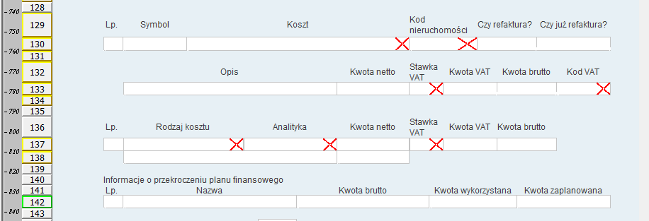
Figure 6. Example of Invoice form
End of form header
Denotes the last row that will belong to the form header. Row number 2 has been marked as the end of the form header, the form header consists of rows 1 and 2. The form header will be added at the top of each page of the document in PDF format.
Start of internal table header
Denotes the first row that will belong to the internal table header of the form. The last row of the internal table header is the row preceding the row marked as Internal table row. For example, row 20 has been marked as the beginning of the internal table header, this header consists of rows 20 and 21. The internal table header will be placed on each page of the document in PDF format in the situation when the internal table is moved to this page.
Internal table row
Denotes a row that can be duplicated when filling out a form, allowing the user to enter multiple items of a given type.
Duplicate rows allow you to add rows with identical characteristics, e.g. in the internal table of the form, where the number of rows is not predetermined and depends on the person filling it out. The user can add the required number of rows to the internal table of the form. To do this, when creating a form in the Form Editor, right-click on the row that is to be duplicated. From the context menu, select the Internal Table Row option. This will highlight the row number in green.
Beginning of repeating section
Designates a row that will be the first row of a repeatable area when filling out a form. The start of a repeatable section can only be a row that meets the following criteria:
- is not an internal table row
- is not in any other repeating section
- does not contain any cell that is vertically merged with a cell in the row above.
End of repeating section
Designates a row that will be the last row of a repeatable area when filling out a form. The end of a repeatable section can only be a row that meets the following criteria:
- is not an internal table row
- is not in any other repeating section
- does not contain any cell that is vertically merged with a cell in the row below it
- the closed area does not contain any internal tables
- the closed area does not contain any other repeating sections
Form Footer Start
Denotes the first row that will belong to the form footer. The form footer will be added to the bottom of each page of the PDF document. If there is a row marked as the start of the form footer on the sheet and the parameter pdf.showPageNumbers =true is set in the eforms /web/ config.properties file , page numbering will appear on the pdf page.
Page Break
Designates the line from which the form content will be moved to the next page of the PDF document.
Multiple rows defining internal tables and their headers can be marked on the form; the limitations in defining these structures are as follows:
- Internal table rows cannot be adjacent to each other on the form,
- An internal table row cannot contain vertically merged fields,
- The start row of an internal table header refers to the closest internal table row below this row.
Form column operations
Selecting columns
To select a single column, click the mouse button above the column header.
It is also possible to select multiple columns by holding down the SHIFT or CTRL key between clicking on the column headers. A column is selected when all the fields in that column are checked.
Inserting a column
To insert a new column, right-click on the column header and select Insert Column. Inserting a column copies the formatting from the column you clicked on.
Column duplication
To duplicate an existing column, right-click the column header and select Duplicate Column. Duplicating a column copies the formatting and content from the column you clicked on.
Deleting a column
To remove a column, right-click on the column header and select Delete Column or Delete Columns.
Adjusting the column width
To adjust the width of a column to the contents of the fields within it, right-click on the column header and select one of the width adjustment options:
- Fit Column - changes the column width so that its width is the minimum width needed to display the field's content; works on the column on which the context menu appeared,
- Extend Column - an operation similar to the previous one, with the difference that no width reduction is performed, i.e. if the column is wider than needed, its width will not be reduced, but if its width is too small, it will be increased; works on the column on which the context menu appeared,
- Match Columns - identical to Match Column , except that it works on all columns that are selected,
- Extend Columns - Identical to Increase Column Width , except that it works on all columns that are selected.
Width matching for merged fields works in such a way that if the column on which the matching operation is performed is the last column of such a field, then it is taken into account. It causes matching of only the last column - reducing or increasing its width depending on the selected option.
Set the width of the column(s)
Allows you to specify and set the width of columns. The width is set via a dialog where the user enters the width of the column/columns in millimeters rounded to a point (assuming that 1/72 of an inch is a point).
Set width for margin
Sets the width of the first and last columns using a dialog identical to the "Set column widths" option.
Form background
On the form, you should select an area or the entire sheet (e.g. by clicking on the screen button * in the upper left corner), for which the background will be defined. Then, in the Form Field Attributes table, set the background color as undefined (last item on the list). In the next step, in the Form Structure tab , in the Background File line , click on the screen button
  . In the Open file pop-up window , indicate the file and click on the button
  .
.
Form View Areas
Area Management allows you to selectively make groups of form fields available in a Form View within a Task of type "User" executed within a docuRob®WorkFlow process instance.
Visibility rules can be used in form preparation scripts executed during form sharing. Area visibility rules can also operate based on form presentation module call parameters defined within the definition of the appropriate Action.
Creating form areas
The area definition window is opened using the button located on the form window toolbar.
The main part of the window contains a list of form areas, each row defines one form area. The area name should be a concise string that will easily identify the form area, the area name is used in scripts and in the form filler to identify areas.
To add a new area, select the Add area option from the context menu available after pressing the right mouse button or press the Add area button. The newly created area definition has a randomly generated name, which must be modified.
To modify the name or label of an area, double-click on the given area attribute, make the changes, and confirm the modification by pressing ENTER.
Delete area option from the context menu available after pressing the right mouse button over the selected area definition.
Assigning fields to form areas
The form designer assigns form fields to areas by selecting the fields on the form and selecting the areas to which the form fields are to be assigned in the Area attribute (available in the list of form field attributes).
Assignment to a form area(s) means assigning an attribute to a group of attributes associated with the given area( s ).
Form files
The file definition window is opened using the button located on the toolbar of the form window. The provided services allow you to Download a file from a local disk or to Exchange an already downloaded file. The file is stored in the XML structure of the form.
In the case of large files, the storage of which in the form may affect the increase of the time of the form view presentation, a solution can be used consisting in placing a Link to the system's binary resources repository in the form field. In such a case , the field type should be refiled to text ( Text field type ).
The operation of saving a file and creating a Link to a file saved in the system binary file repository or in any other repository is usually performed within the Postaction of the process activity. In the implementation of the appropriate BPQL script, appropriate file handling functions can be used.
Form presentation parameters
attachment.cell.sizethreshold=2000000

attachment.cell.sizemax=5000000

attachment.cell.destination.path=/tmp/eforms-cache

renderForm.handler=pl.rodan.eforms.integration.xmldata.XMLDataFormHandler

pdf.showPageNumbers=false
script.executionForced=false
layout=panel