
Form Editor
Form Editor is a module of the docuRob®eForms system used by the form designer. This module defines the taxonomy, the appearance of the form, and the relationships between the form cells and the taxonomy. The taxonomy allows you to separate, organize, and document concepts that are then used to create electronic forms.
Since the form taxonomy is loaded automatically based on the selection of attributes assigned to the created form type from the central Data Dictionary, we can ensure data type compatibility between all forms created for a given user organisation. Therefore, an important step in the methodology of implementing application solutions based on the docuRob® platform is to create and maintain a central data dictionary containing all attributes used to define form field values.
Creating a data model taxonomy for the entire application area and for individual forms is one of many steps in defining the ontology of the information system being built. Support is provided by the appropriate functions of the docuRob® Ontology module responsible for managing all ontology elements of the created applications and for parameterizing the docuRob® system**.** The ontology model is compliant with the Topic Maps standard (ISO/IEC 13250) and the designer tools available in the interactive design environment include, among others, the TMSL language (Topic Maps Scripting Language) and the integrated TMQL query language (ISO/IEC 18048).
Form sheets can be easily created using the available wizards. Each form page consists of a rectangular grid of fields that can be combined into any rectangular arrangement. docuRob®eForms design tool allows for an accurate representation of the paper form into an electronic form, including fonts, colors, formats, and frames. This provides ample control over the appearance of the form and allows one to use the knowledge one has gained from working with spreadsheets to create a form with any appearance.
docuRob ®eForms Forms Editor allows you to associate a script with a form , which can be used to program the form's handling. Using scripts, the form designer can define any advanced rules for validating data entered into form fields or create a program that exports data to XML format or any other data composition model.
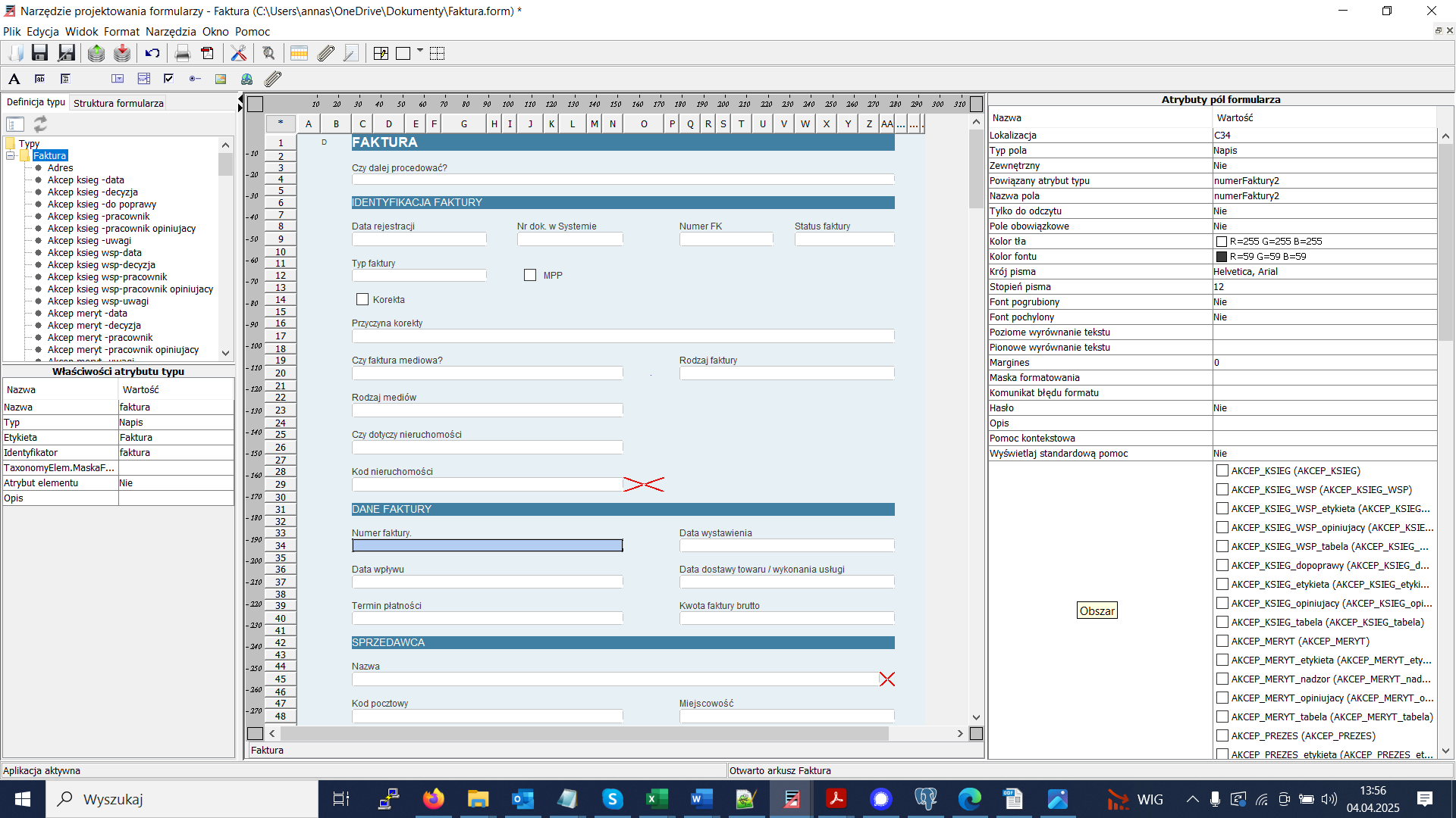
Figure 1. View of the docuRob® eForms form editor
The functionally complete form definition of the docuRob®eForms system includes a number of design perspectives covering both static and dynamic aspects of the user interface that occur within User tasks in processes managed by the docuRob®WorkFlow platform .
Form Data Types
Each form field has a specific type and, therefore, a set of attributes associated with its type.
Label
At any point in the form you can enter text, which is typically used to create a Label for another field of any type, used as a permanent element of its structure.
Text
Allows you to enter a single line of text into the field value. The text will not "wrap" when the field width is exceeded (if the entered text exceeds the field length, it will not be visible in the form field).
Multi-line text
Allows you to enter text into the field value, which can be split into lines using the Enter key . The text is automatically "wrapped" and the field height is adjusted to the contents.
Note
This type is a modification of the "Multiline Text" type. The height of the field is not adjusted to the content, instead a scroll bar is available.
Logical (checkbox)
Allows you to select true/false values (checkbox checked/checkbox unchecked).
Switch ( radio button )
Selects one of several predefined values.
Numeric - integer
Allows you to enter an integer into the field
Numerical
Allows you to enter a floating point number into a field.
Time
Time field type is represented in the form filling application by a field for entering the hour and minutes.
Date
Date type field displays a calendar in the filling application and allows you to enter a date by selecting from the calendar.
URI address
You can enter a URL address into the "URI Address" type field. Clicking on this field in the form filling application will launch the browser and display the page indicated by the given URL address.
Dictionary
After entering the edit field of the "Dictionary" type, a window appears allowing you to search and select an element. After making a selection, the labels and identifiers of the selected elements are transferred to the form. The functionality of the checkbox is only available when filling forms in a web browser, it is not available in the Form Editor.
The following selection box operating modes exist:
Dropdown lists
Allows you to select one of the options displayed after clicking the value selector control. An example is shown in Figure 2 .

Figure 2. Example of a drop-down list
Single-select list (radio button)
Allows you to select one item by clicking on that item in the list of possible values.
Multiple choice list (checkbox list)
Allows you to select multiple items by turning a switch on/off at possible values.
External dictionary
A field that allows you to enter an item from an external dictionary (defined, for example, using TMSL). Clicking the field causes a window to appear with the defined external dictionary and the option to select one of the items. Then, this item is copied to the form field (fields) specified using the external dictionary attributes. The field to which the dictionary item is transferred must have the External attribute set to "YES"
Picture
Allows you to place an image on a form. The checkbox functionality is only available when filling forms in a web browser, it is not available in the Form Editor.
File
Allows you to attach a file to a form. The file is stored within the form's data structure as an element of the XML data model.
It is also possible, for large files, to create Links to binary files stored in the docRob®ObjectManager repository or any other file repository.
Special types and auto-matching
A "multiline" field is a type where, when you edit it, the line height adjusts upwards so that all the text you enter is visible.
Attributes available for all field types
Location
Specifies the location of the selected field on the form, for example B3 means that the selected form field, or the upper left field for a merged field, is in column B, row 3.
Field Type
Defines the type of content of the form field. Depending on the selected value, the content of the field on the form changes, as well as the number of its attributes (the list changes after entering the field edit). After selecting the field (clicking with the mouse), the following values are available: string, multiline text, footnote, logical, numeric integer, numerical, time, date, URI address, dictionary, checkbox .
Related Attribute
Contains a binding of a form field to an attribute of type . This binding defines the meaning of a given form field. The value of this attribute is set using the Bind to Attribute of Type operation , and removed using the Unbind to Attribute of Type operation (these operations are available from the context menu for a form field).
Field name
Defines a form-wide unique name that is used in form scripts to identify a given form field. The form field name is a second way, in addition to the type attribute, of identifying and thus giving meaning to form fields.
Read only
Determines whether the field can only be modified (edited) by the user when filling the form in a web browser.
Required field
Specifies whether entering data into a field is mandatory . If a field is mandatory, the user is required to enter a value for the form field before saving the form while filling the form.
External
An attribute specifying that the field cannot be edited but can be filled with scripts and by passing the position of an external dictionary .
Attributes that affect the appearance of a form field
Background color
Specifies the background color of the form field. After selecting the attribute (clicking with the mouse), a list of predefined colors appears, as well as a button that opens the color selection dialog.
Font color
Defines the color text in the form field. After selecting the attribute (clicking with the mouse), a list of predefined colors appears, as well as a button that opens the color selection dialog.
Font
Specifies the font type for the form field. The list allows you to select one of the following font groups: sans serif (e.g. Helvetica, Arial), serif (e.g. Times New Roman), or fixed width (e.g. Courier).
Fond level
Specifies the text height for the form field.
Bold font
Bold font will be used in the form field .
Italic font
An italic font will be used in the form field .
Horizontal text alignment
Specifies the horizontal alignment type of the form field contents (left, center, right).
Vertical text alignment
Specifies the vertical alignment type of the form content (top, center, bottom).
Attributes for text types
Formatting mask
The formatting mask is used to check the contents of a text field, defining the characters allowed and their position in the text field. The formatting mask can contain the following special characters:
| Sign | Description |
|---|---|
| # | Any digit (0 .. 9) |
| ' | A special character that allows you to place a character representing another special character in a pattern. |
| AT | Any letter, lowercase letters are converted to uppercase equivalents. |
| L | Any letter, uppercase letters are converted to lowercase equivalents. |
| AND | Any letter or number |
| ? | Any letter |
| * | Any character |
| H | Any character defining a hexadecimal number (0-9, af or AF) |
Table 1. Characters used in the text field formatting mask
For example, the mask "###-####" allows you to enter the following strings "123-4567", "324-8344".
Format error message
Defines the error message displayed when text is entered that does not match the formatting mask.
Password
If you mark a field as password , this field will be represented as a string of asterisks and its value will be invisible from the browser.
Separating letters
Displays text in a table with a visible border and cell divisions . Each letter of the text is placed in a separate cell. The attribute works only if the maximum text length is specified, which specifies the number of cells. The remaining text will not be displayed.
Attributes for numeric types
Attributes for numeric types are used to restrict the allowable values for numbers and to format text representing numbers.
Digit group size
Specifies how numbers will be displayed in the form field (e.g. a value of 3 means to display the number 4000000 in groups of three digits, i.e. '4,000,000')
Number of significant digits
Specifies the maximum number of digits in the integer part of the entered number.
Number of decimal places
Specifies the maximum number of digits that can be entered after the decimal point.
Total maximum
Specifies the maximum value that can be entered into the field. Valid only for integer fields.
Minimum total
Specifies the minimum value that can be entered into the field. Valid only for integer fields.
Allowed negative
Determines whether the field can contain a value negative .
Floating point maximum
Specifies the maximum value that can be entered into the field. Valid only for numerical fields.
Floating point minimum
Specifies the minimum value that can be entered into the field. Valid only for numerical fields.
Significant digit alignment
Specifies the number of digits to which the integer part of the number will be aligned, e.g. with alignment 3, entering the number 1 will result in the appearance of the string 001.
Decimal alignment
Specifies the number of digits to which the fractional part of the number will be aligned , e.g. with an alignment of 3, entering the number 1 will result in the display of 1,000.
Expression
In order to enable automatic calculation of the cell value, the Expression attribute should be completed. You can enter any expression in it that complies with the JavaScript syntax (mathematical functions can be used). As variables, you should use the names of cells whose values are to be used to calculate the expression. If the Expression attribute is filled in, it is not possible to manually edit such a field on the form.
Function
In order to enable automatic calculation of the cell value, the "Function" attribute must be completed. It must be filled in with the name of the JavaScript function to be called and/or the name fields whose values will be passed as parameters of this function. All names must be separated by commas. An example of use is the conversion of a numeric value (currency) to a text value. In the "Function" attribute, enter: setMonetaryText,CURRENCIES_FIELD_NAME
Attributes for image type and external dictionary and checkbox
Image URL
For the picture specifies the address from which the image will be downloaded.
For a selection field, specifies the address of the page making the selection; when filling out the form, this page will be displayed in the edit area of the given form field.
File
Allows you to load an image directly into the form definition. Once an image is added, the URL attribute is ignored.
Adapt to mobile
If this option is checked, the image is resized to the height or width of the cell while maintaining the image's proportions. If the attribute is not checked, the image is displayed in its actual size.
External Dictionary field type
URL address
Address of the page displaying dictionary entries, the address may contain parameters for the dictionary page. Example of calling a dictionary that retrieves data from the function tmsl TopicMaps: web/jsp/dict/tmsl.jsp?tmsl=http://www.rodan.pl/psi/tmsl-function/getEmployeesFromCurrentDivision
Image URL
Dictionary icon url
List of input cells
Field names from which values are to be taken and passed as dictionary parameters, separated by a comma (e.g.: field1, field2, field3)
List of cells to fill
names of fields to be filled separated by comma
the first field must be a dictionary field with the "external" attribute set, the Dictionary item label and id will be entered into it
the remaining fields are entered as field_name=psi_attribute_of_dictionary_item
(e.g.: pole1,pole2=psi_atr_1,pole3=psi_atr_2)
Attributes for the Switch type field
Group
Specifies the field group to which the given Switch type field belongs . When creating multiple Switch type fields and binding them to the same fixed attribute, the group is created automatically. The form user can select only one Switch field from the group at a time.
Field value
Specifies the value (associated with the attribute associated with the field) that the selected Toggle field represents . When the user selects the Toggle field, the value specified in the field's Value attribute is selected .
Other attributes
Dictionary
Specifies the name of the dictionary from which the items available later in the form field selection field will be retrieved*. After selecting the field (clicking the mouse),* all available dictionary names (labels) are displayed . After selecting the dictionary and going to edit the field, all values (fields) for the selected dictionary are available in the list.
Description
Defines a designer comment for a form field.
Contextual Help
Defines the help text for form fillers, which will appear as a "bubble" in the form field. When the attribute is selected, a text field appears containing the current hint text and a button that opens the context help text editor.
Area
Specifies the areas to which the form field is assigned . Each form field can belong to multiple areas and such association is most often used to control the visibility of form fields within views used in process tasks implemented in the docuRob®WorkFlow system .
Editing form fields with type attributes
Assigning types using the Drag&Drop method
The form editor allows you to arrange form elements using the Drag&Drop technique. For example, by pointing the mouse at an attribute in the taxonomy window, clicking the left button and holding it, we can drag the element to any cell in the form. After releasing the mouse button, the form field will automatically take on the appropriate settings for a given attribute type , e.g. text field for String type attributes, multi-line field for multi-line text type attributes, drop down checkbox for dictionary fields, etc.
Editing a Switch type field via Drag&Drop
After dragging the Switch type attribute to several selected form fields using the Drag&Drop method , the dragged attribute will be automatically assigned to the selected fields. These fields will create a list from which you can select only one element from the dictionary connected to the Switch type attribute. The fields to which the Switch type attribute was dragged using the Drag&Drop method will be connected to the same dictionary (defined for the attribute) and a common group will be created for the selected fields.
Keyboard shortcuts
The Form Editor uses keyboard shortcuts to facilitate operations on form fields ( Figure 3 ). The description of keyboard shortcuts is available from the main menu Help → Keyboard shortcuts .
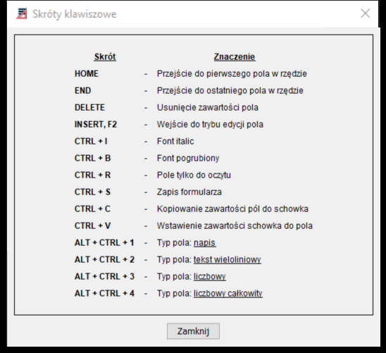
Figure 3. Form Editor Keyboard Shortcuts
Choice type elements
Elements of the choice type allow you to model sections on the form that will be visible on the form depending on the selected option. Moreover, an element of the choice type that is not selected will not be generated in the form data xml file.
Choice type elements on the form, drag the Choice field icon (radio button) onto two different fields on the form, and give these fields names (e.g.: EntityType1, EntityType2).
Then drag the attribute whose value will decide which choice type element is to be active (e.g. String type ) onto both of these fields.
In the next step, you need to place on the form the attributes that are to belong to one of the choice elements (e.g. simple attributes that are part of the complex attributes "Person" and "Institution").
Then, in the knowledge base for the complex attributes from the above example, you should enter in the " Condition " field the condition under which a given choice element is to be generated in the XML file with the form data (e.g.: typPodmiotu2 = TRUE for the Person complex attribute and typPodmiotu1 = TRUE for the Institution complex attribute ).
This way, only elements from the section for which the choice condition was met will appear in the form data xml file .
To get the effect of appearing/hiding appropriate fields on the form depending on the selected choice field , you should:
- add x form areas ( where x is the number of choice check boxes );
- assign fields belonging to choice elements (in this example all person and institution fields) to the appropriate areas;
- in form preparation and validation scripts, appropriately show and hide areas depending on the selected choice field .